It’s not even more aesthetic. Just more unified in branding.
And the interface of their apps are still incoherent af. I don’t know how, but they manage to make things worse every time
It’s ok, they’ll just retire the service eventually.
Yeah, the old logos were all over the place. At first glance it’s not obvious they’re all Google apps.
And? All of those being part of the same walled garden is a bug in the legal system not a feature.
Whatever. It sucks ass is the point.
My point is that it’s also ugly.
Since Gmail doesn’t have the obvoious envelope anymore I often open it when I want to open Maps. My brain ist like “M for Maps”.
Triumph of visual design over interactive design. These days, most “designers” only care about graphics visually. The much deeper science of how people use and understand things is beyond them. Worse, they think the problem is that everybody else does not “get” visual design.
Style over substance.
Case in point: Every single thing Microsoft is doing in Windows these days.
I keep all my Google icons quarantined in one folder. Case in point:

I use nova launcher. It allows you to replace any app icon by any png file. So you can download the old icons from the internet and use them on your phone. It’s a lot of work and I agree Google shouldn’t have done this, but at least you can revert it if you want to put in the effort.
Lol at the Photos icon. How does that in any way represent a photo or a camera? I guess it’s an iris shutter but that’s not something you notice too often on a real-life camera.
I think it was flower at some point.
I thought it was a shutter
Yea, it’s abstracted but based on aperture blades of the shutter.
I think it’s kinda morphed into a pinwheel, which still sorta makes sense as pinwheels have been a staple of photo and camera advertising for their bright colours and rapid movement.
Yea. I can’t actually recall the icons before the rebranding.
What I keep seeing: $ $ $ $ $
Also I’m sure the designs are absolutely as humanly possible adapted to perfectly achieve their goal. Too much money, people, and time involved for this not to be the case.
And the goal was never ease of use, that doesn’t bring in any more money when you have a monopoly. Engagement & forced ads do.
(By ‘forced ads’ in this case I do not mean directly advertising a specific product, but forcing you to pause your thoughts to specifically and consciously think about Google making the name/brand ever more part of your actual life and as such its shitty behaviour gets normalised, even trusted - thats just how our brains work even when we think otherwise … and I hope we all think of Google as a curse on humanity.)I actually think these are fine. If I can quickly recognise each on my homescreen (I don’t use labels) then it’s fine, and I’ve never had a problem with any of these.
I like it because each company each has its own set of apps, and they have somewhat unified app icons.
Proton is the same, which similar icons as google but with their own unified branding.
I like it, personally.
i think they did need to unify the design and branding but i also agree they went too far with it. if they had only chosen 1-2 colors for each app icon that would have helped a lot.
gmail - red
drive - yellow
maps - green
meet - blue
calendar - lighter blue
problem solved
Problem solved! If we ignore the world’s ~300 million colorblind people.
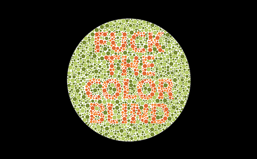
is that the one that says “fuck the color blind” because if so hey!! that’s not nice
Hey, color blind people deserve sex, too!
No way dude, it’s the other one that says, “we love the color blind.” Really.

i think they forgot to mention: they’re not all the same shape.
True. Colorblind people come in all shapes and sizes.
Ah, the old Lemmy shapearoo
Worked for a few jumps but then it sent me to kbin with a 50x error 🤷
Edited my comment with a different link, should be a bit longer now
Hold my shape, I’m going in!
oh no not again
Except that the original post was contesting that those shapes are indistinguishable from each other. My point, therefore, is that the solution offered in the post I replied to would still be indistinguishable to 300 million people.
the squares are there for comedic effect. the shapes are not actually indistinguishable. but at a glance, color is a much faster tool we use to identify these icons. so the problem here is that it takes longer for us to decipher a Google app icon, and the solution would be to differentiate the colors.
also this would help colorblind people as well, because removing unnecessarily complicated colors would make the shapes easier to identify as well.
I wouldn’t even call this “aesthetics”. Rather “conceptual homogeneity” or something like that. It’s what happens when you strive for a uniform look over a useful or visually pleasing one.
In some countries uniform look at least provided good for society. In this case it provides only profits for to 1%.
Good for society:

Even uniformity can be aesthetically pleasing, but these icons are decidedly not.
Color is the first thing the eyes tend to notice, then shape, then lines and details. The new icons all look the same at the edge of my vision, I have to look at them straight on to distinguish them. Individually each one is fine but together, like what the hell?
I don’t rawdog Google icons anymore anyway, I use an icon pack
The homogenization of these icons has been a long source of consternation for me.
They’re barely functional as icons; you can scroll right by them and miss them; which makes finding the apps in a list of apps a bit annoying sometimes. Removing each icon’s unique color scheme and replacing it with the ‘company 4 colors’ was the stupidest fucking idea ever.
Even more infuriating is how they keep renaming the applications to unexpected things every so often; so they move around; and it’s dreadfully annoying to remember if they prefixed the name of the app with a G or something else completely different, which renders strict alphabetical sorting a bit moot.
It can get even worse. My phone lets me do this to my icons which is ridiculous. I think this was opt-in but now that I’m going through my settings again I can’t actually figure out how to turn it off lol
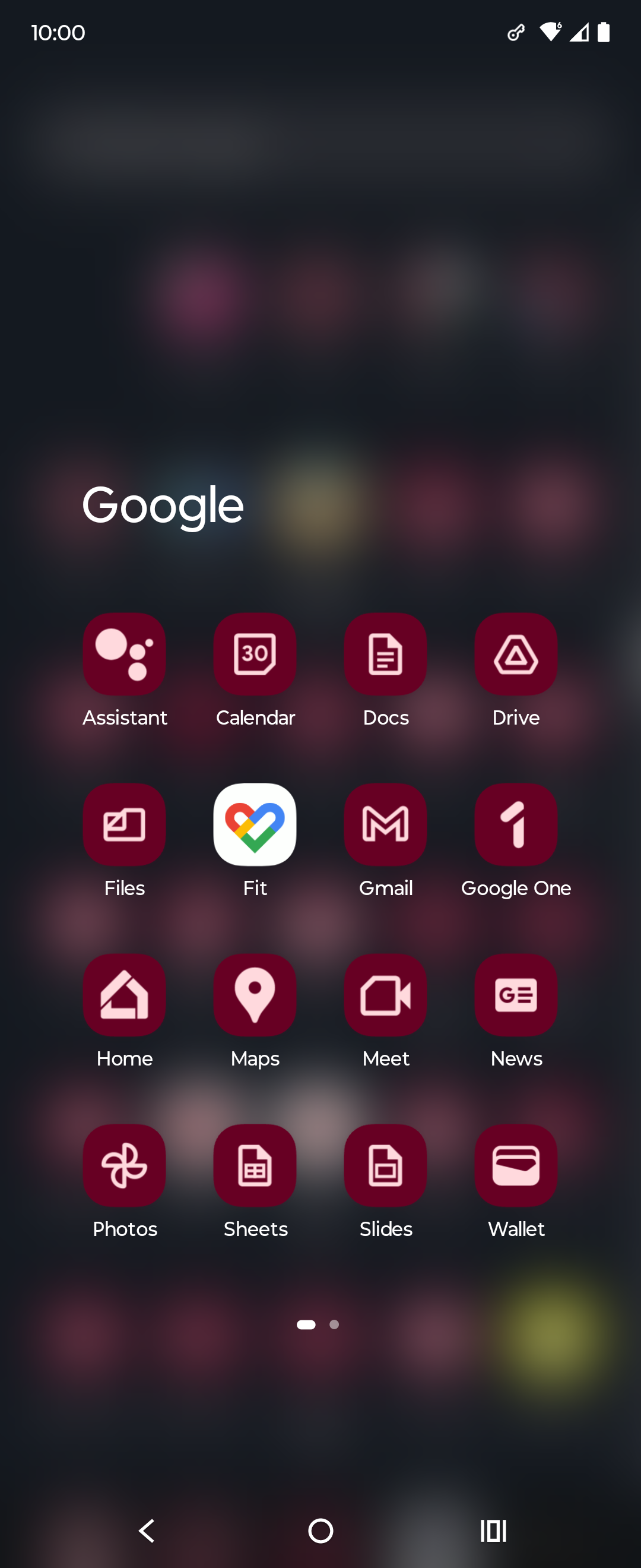
[It could be sooo easy to solve, but noooo…

Without the distracting colors, now I can see this says MAPOD
The absolute worst is the idiotic “let’s make all app icons the same shape” thing.
Not Google related, but whoever decide that the best color scheme for an Office suite should be light grey text on a white background deserves to be flogged.
There’s always a yoyo effect with design. I fully expect Google to swing back to gothic palette and highly detailed icon within the next decade.
oh noooo icons sharing a common design language and color scheme? the absolute horror.
if you can’t tell the difference between these icons i have a great educational resource for you
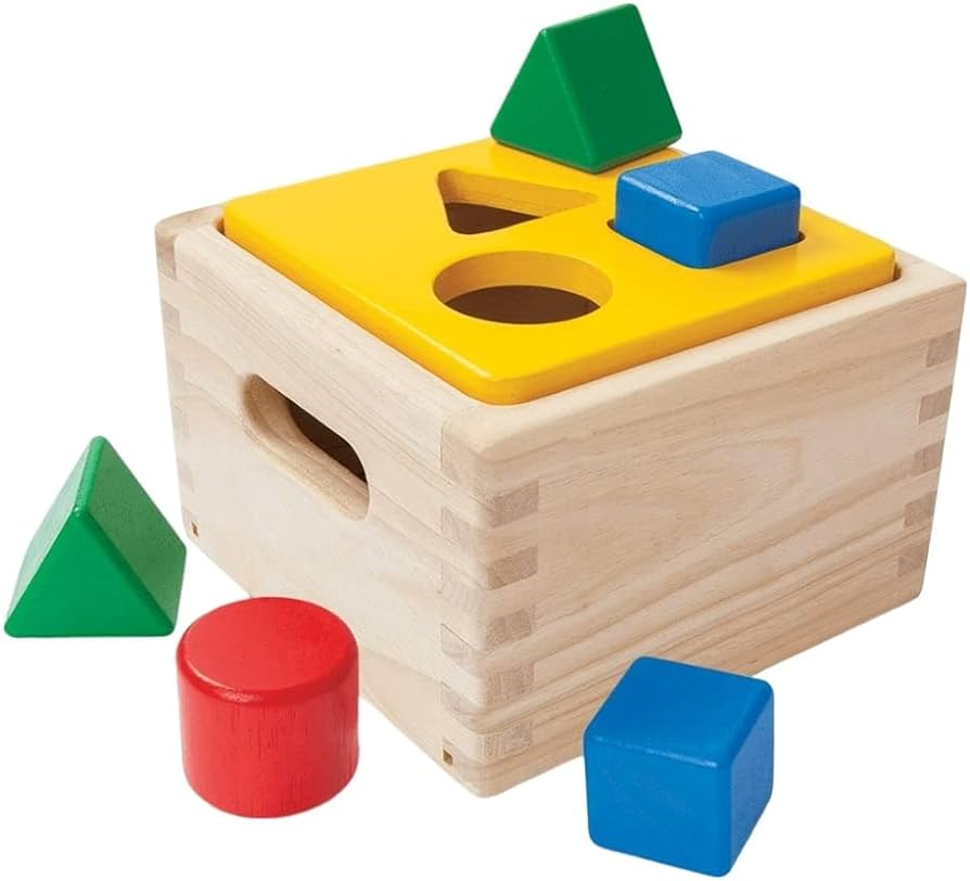
nah I still recognized all of them as google products bc they use the same 4 colors, but in different interesting ways. gmail was all red but a letter shape. Maps was a red pinhead. drive was a triangle but used all the colors but red. Calendar was a less noticeable shape but instantly recognizeable as a tabletop day calendar. now everything has to use all 4 colors and the shapes are so small that the colors can’t do enough on a phone screen to differentiate themselves.
They already had a common design language and color scheme. Now they have a samey-ness to them that takes away visual interest.

