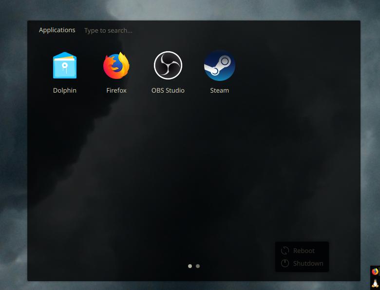
If anyone is wondering why I have an extra reboot/shutdown window, it’s because the menu I use for apps doesn’t have it and I don’t like the menus which do. :D

steal my look:
- 2 toolbars, 1 on top centered, 1 on right adjusted to the bottom, both made as short as they can be with 20px thickness
- top toolbar has Digital Clock and System Tray, bottom right toolbar has Icons Only Task Manager adjusted so new icons spawn on top and a “Minimal Menu” set to tux as the icon
- top toolbar set to floating, bottom right not
- both toolbars set to translucent and window go below (this is the most important for my setup to me)
- Breeze app style
- metadata toolbar (“Kanagawa KDE” in the store)
- Breeze Dark DeepDark colour variant
- Breeze window decoration
- default KDE fonts
- Keepin icons theme (I change it around a lot, but it’s my current fav)
- DeepinDark Cursors (alt: BreezeX-Black)
- Compact Shutdown Settings for the window on my desktop to be able to conviniently turn off / restart my PC

How did you achieve this? Custom code?
Nope, just saying I don’t use any transparency for my panels. I don’t mind it overlapping and hiding part of the window bar because the important stuff is all on the left side of the bar.
Sorry, I’m just a dummy and my brain sometimes swaps the meanins of opaque and transparent in my head. xd
Hah! All good, I know exactly what that one feels like!